Clubcard app
Central Europe countries:
Czech Republic
Slovakia
Hungary
2 663 000
active users
(6 weeks)

Improving clarity in the Offers section
The Offers section was designed to help users browse promotions efficiently. However, analytics and user feedback revealed a major issue:
❌ The leaflet and catalog felt like two separate, unrelated features, even though they displayed the same promotions.
❌ Users weren’t aware that they could use both views to explore offers more effectively.
This led to low engagement and frustration, impacting both the user experience and business goals.
My role and approach
As the UX Designer, I worked closely with stakeholders to discover the issue and explore solutions. My approach included:
📊 Data & Analytics – Understanding user behavior and drop-off points.
🔍 Competitor Analysis – Benchmarking against other retailers’ offer browsing experiences.
📢 User Research Review – Synthesizing past research to identify pain points and user expectations.
🧠 How Might We Framework – Defining problem-solving questions:
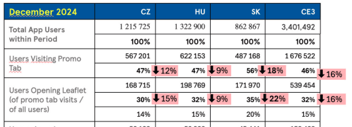
drop by 16 % in CE
Comparison with previous month

competitor analysis
over CE
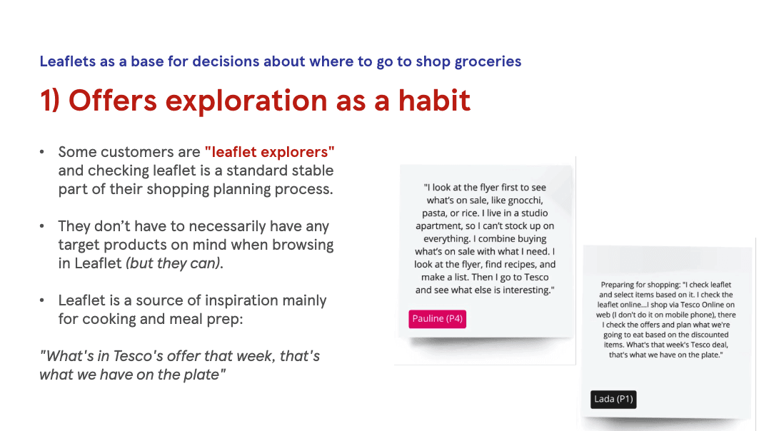

going back to user research
Exploration and solution concept
Based on research and stakeholder collaboration, I developed multiple design hypotheses and created several prototypes to validate different approaches:

using UK design system - some CE components were replaced with DDS components
introducing Filter and Search
Use case: browse offers, no search for leaflets, search for bananas, filter, sort


Impact & Next Steps
Identified usability issues causing confusion.
✔ Recommended clear design solutions aligned with business goals.
✔ Provided a roadmap for usability testing of design variants.
📌 What’s next?
The project is waiting to get usability testing results.
Insights
Alignment with design system - key consideration in this project was maintaining alignment with our existing design system to ensure consistency, scalability, and ease of implementation
Grid vs carousel view - while the grid view allowed for quick scanning and easy comparison of multiple offers at once, the carousel view provided a more focused on one item at a time.
